
Project Overview
Studio Sculpture is a cutting-edge digital design agency dedicated to providing a comprehensive range of services tailored to enhance the overall experience for our esteemed clientele. With a vision of offering innovative solutions, our agency is meticulously crafted to assist clients in various tasks while ensuring a responsive approach with seamless availability on both desktop and mobile platforms.
My Role
Ux/Ui Designer
Ux/Ui Researcher
Tools
Figma, Photoshop, Adobe Illustrator
Team
Self directed
Timeline
2 months
Problem
Addressing the challenge of differentiating a company in a competitive market while acknowledging the necessity for responsive and adaptable design.
Frequently, when I visit a website, I personally find it less appealing to download the app version. Instead, I prefer straightforward and hassle-free access to the information I'm looking for.
However, it's worth noting that digital agencies and other businesses are increasingly striving to be as approachable as possible. They understand the importance of making their information and services readily available to users without imposing the need for app downloads. This shift in focus highlights the evolving landscape of user preferences and accessibility in the digital age.
"How can we build an outstanding digital agency that effectively stands out in a fiercely competitive market, all while acknowledging that app downloads can often prove to be a time-consuming barrier for our users?"
Solution
Crafting visually stunning, responsive websites with seamless adaptability to all devices, ensuring quick access to information, and offering a user experience that is both efficient and user-friendly.


Research
Deeper Diving Into A Problem
Competition analysis + User research
Recognising the importance of the digital agency's realm, I undertook a thorough examination of the top 4 websites. This process provided me with invaluable insights and revealed potential avenues for enhancement, serving as a catalyst for devising a more innovative and user-centric solution.


You have a 93% chance of standing out and being taken seriously when your vibrant hero section radiates positive energy.
Examining my competitors' websites, I couldn't help but notice that the top-ranking apps, EDesign Interactive and Bleech, have garnered significant popularity by harnessing these particular features. Interestingly, none of the other websites in the field provide these capabilities. Recognising the potential significance of this revelation in influencing my design solution, I proceeded with my research, maintaining an open and inquisitive mindset.
User Interviews


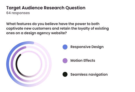

My interviewees exhibited a 4 times increase in their inclination to consider utilising the services of a digital agency when the website's visual design, motion effects, and responsive design stood out compared to other designs in the industry.
"Swiftly, I arrived at a solution on how to capture the attention of potential users without compromising user-friendly navigation, visual appeal, adaptability, and the time consumption associated with downloading an app."
Analysis ( Affinity maps)
By accumulating more than 180 data points, I enabled them to naturally converge into four distinct categories. These categories then became the foundation of my feature prioritization, delineated as "Must-Have," "Should-Have," "Could-Have," and "Would Not-Have." This approach profoundly shaped the design agency, aligning it seamlessly with user desires and requirements.

Insights
"Crafting a successful website hinges on learning from competitors' mistakes while honing our unique vision to stand out in the digital landscape"
Following in-depth analysis and insightful interviews, a pivotal realisation emerged: the website's emphasis must pivot toward the "Must-Have" and "Should-Have" categories. These foundational elements are imperative, forming the bedrock on which the website's sustainability and functionality rest.
Target Audience
"This website is tailored for individuals in search of digital services who also crave an exceptional and user-friendly experience across a variety of adaptive devices."
User Persona
"I created a user persona of Eric, a regular individual aspiring to start a business and seeking digital services. Eric, who deals with ADHD and Dyslexia, is easily distracted and values efficiency, clarity, and real-world solutions."

Site map
If you're in search of digital services, here's the path to follow:

Design
Low Fidelity Wireframes

I dedicated substantial time to sketching and ideation, recognizing the importance of this preliminary phase before embarking on the digital transformation of the user experience. The fundamental concept was to engage in an ongoing iterative process, perpetually adjusting to the ever-changing needs of our users. Incorporating user-centric design principles, I ensured that our iterative process was responsive to the dynamic user landscape.
By prioritizing low-fidelity sketching, I established a solid starting point for the digital transformation, focusing on a visual roadmap that could adapt to meet the emerging user needs. These sketches laid the foundation, providing a visual framework that was subsequently refined and adjusted to better align with the evolving requirements and feedback.
This design approach facilitated seamless iterations, ensuring that the final product remained in sync with the ever-evolving needs and expectations. The end result not only encapsulated the essence of our users' evolving expectations but also reflected a commitment to a design process that remains agile and responsive to ever-changing digital dynamics.
3 notable enhancements resulted in a substantial web design upgrade significantly improving overall functionality, user experience, and visual appeal.


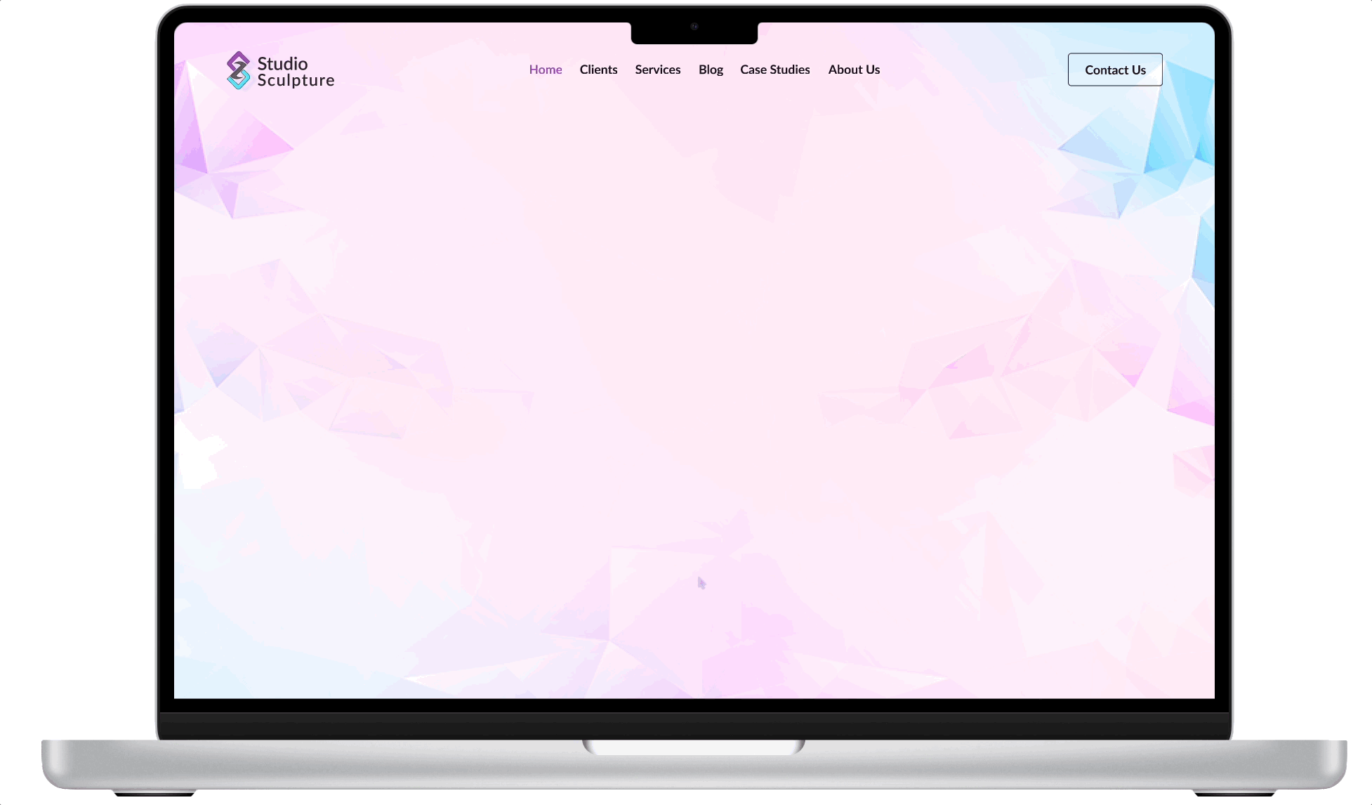
The Final Screens
As I reveal the final screens of Studio Sculpture's responsive web design, I'm confident you'll delight in the experience of exploration.
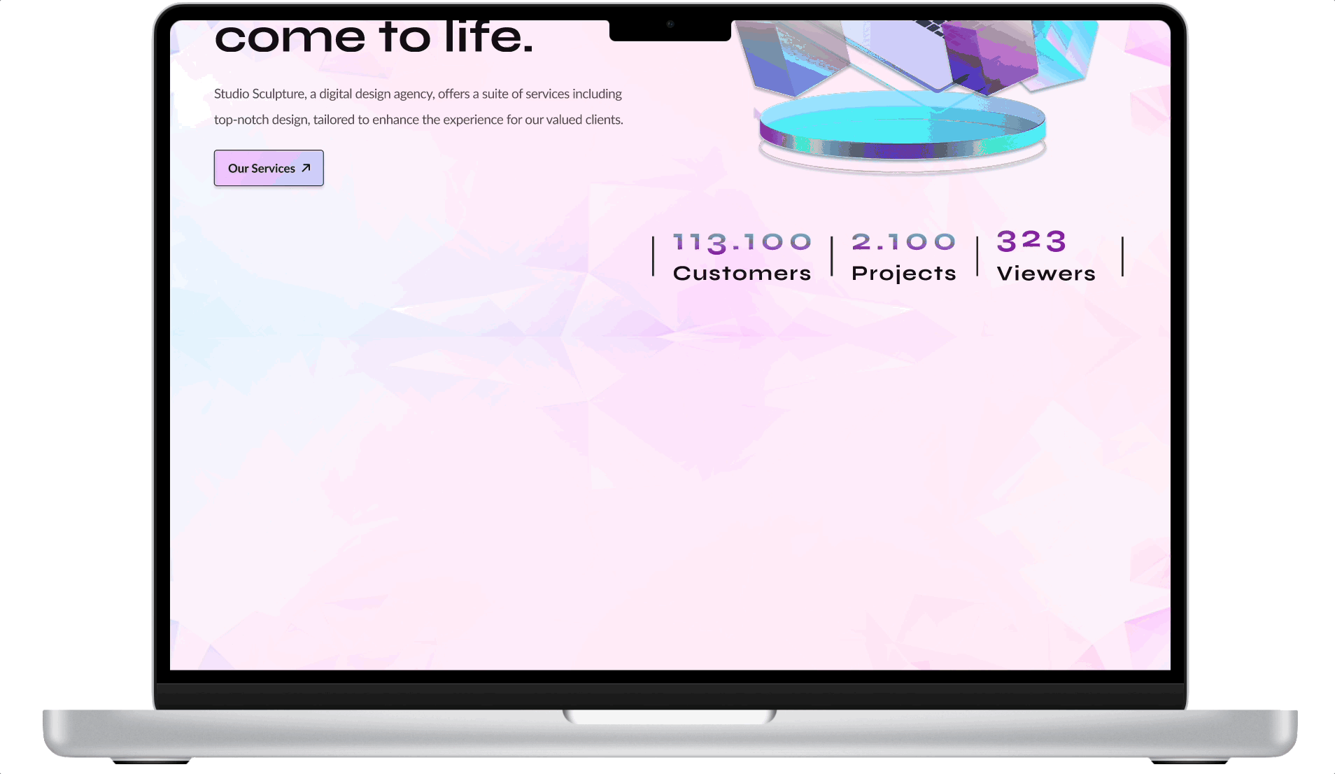
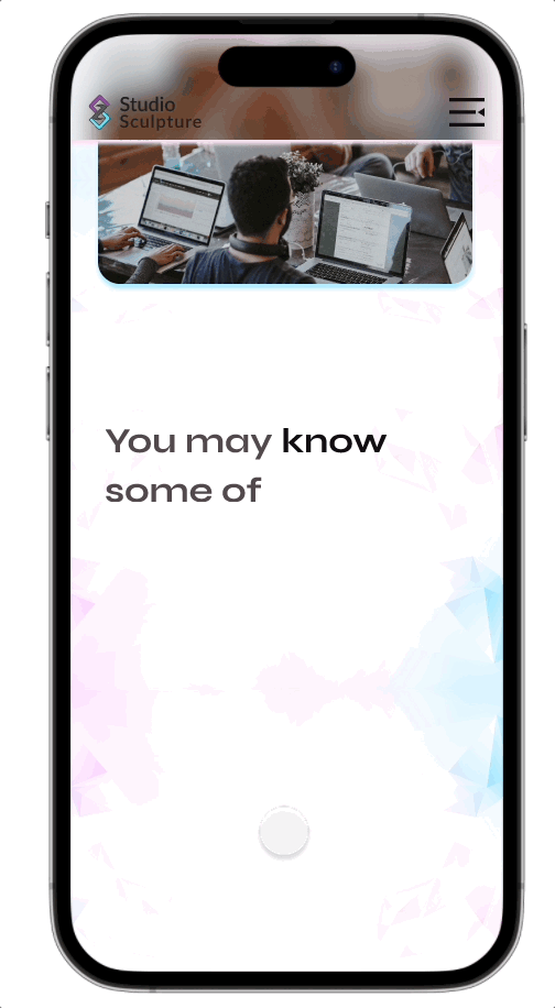
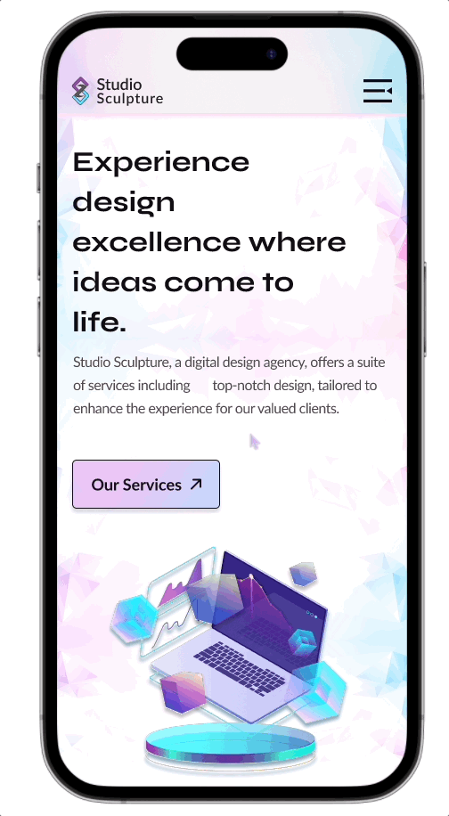
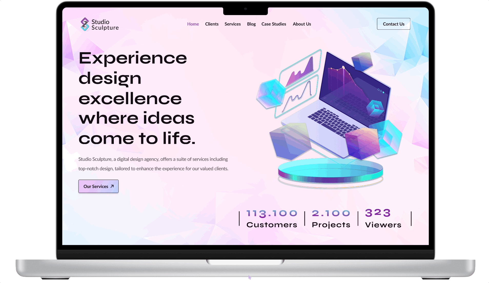
'Hero' Section
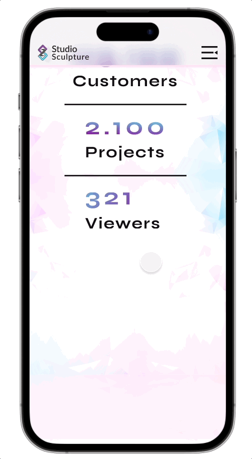
The hero section of our website seamlessly integrates a sleek navigation bar, featuring a splashy and engaging explanation of our company's slogan. This description is complemented by strategically placed call-to-action buttons, inviting users to explore our services. To add a dynamic touch, a live viewer count keeps visitors connected in real-time, while subtle cube animations lend an element of visual intrigue and depth. Together, these elements are skillfully implemented, ensuring a smooth and captivating introduction to our website.
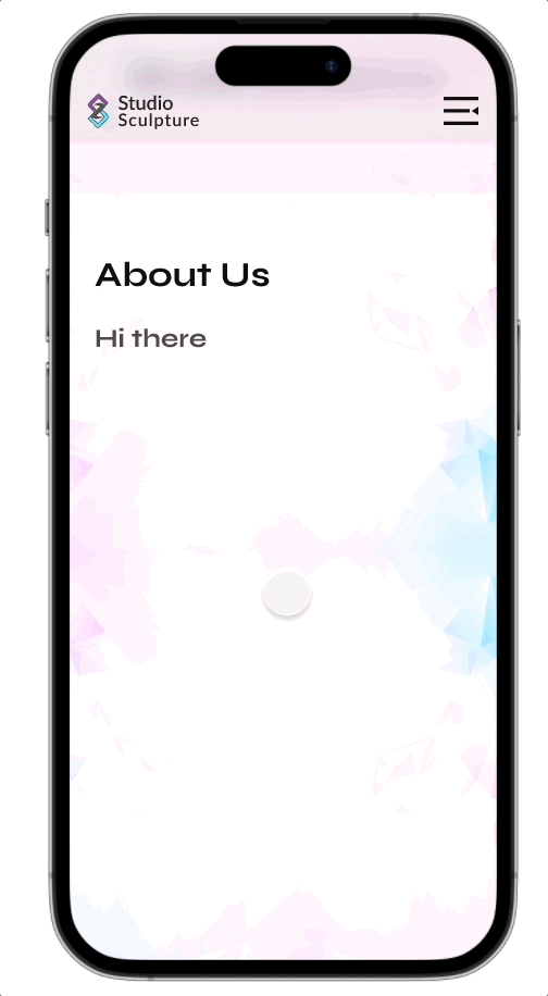
'About Us' Section
In the 'About Us' section, I artfully crafted a compelling narrative that delves into our company's history, values, and mission. This section provides users with a deeper understanding of our brand and its commitment to excellence. With a harmonious blend of visual elements and concise content, we've succeeded in presenting a clear and engaging representation of our identity.
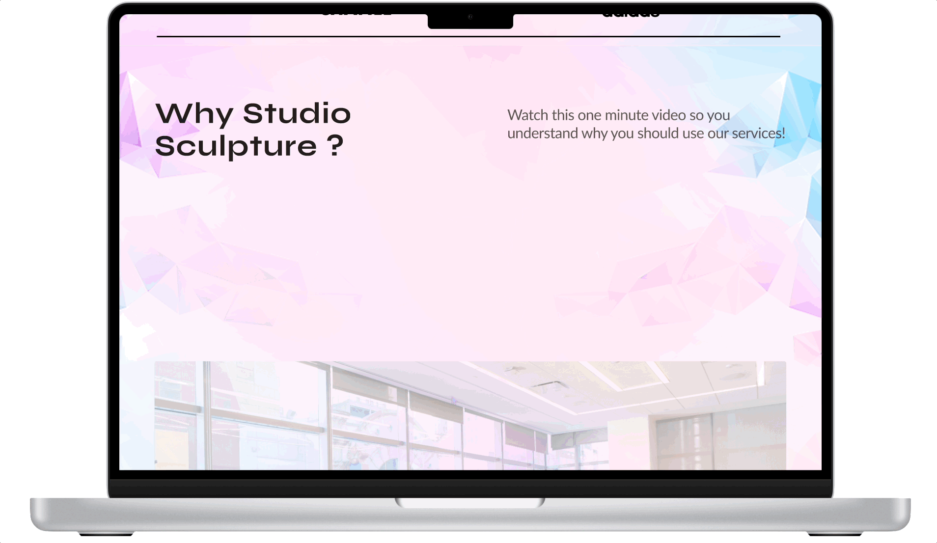
'Why Us' Section
In the 'Why Us' section, I integrated a clickable video that serves as a dynamic and informative tool for potential users to gain a deeper understanding of our company's values and what sets us apart. This video provides an engaging visual representation of our core strengths and offerings, delivering a compelling message that goes beyond words.
'Clients' Section
In the 'Clients' section, I strategically curated and presented a visually stunning showcase of our major clients, enriching the design with captivating motion effects. This not only visually engages users but also communicates the trustworthiness and credibility of our brand through our notable client portfolio.
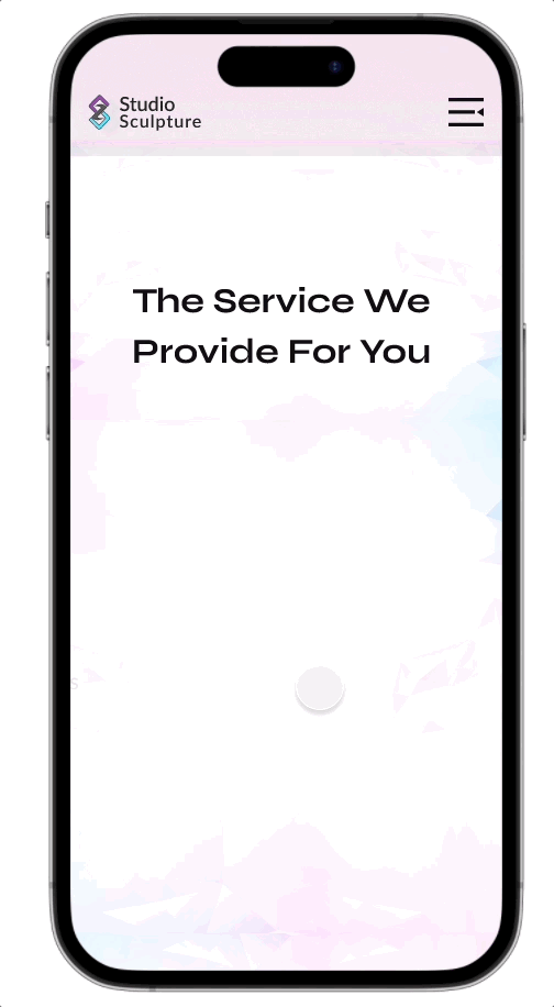
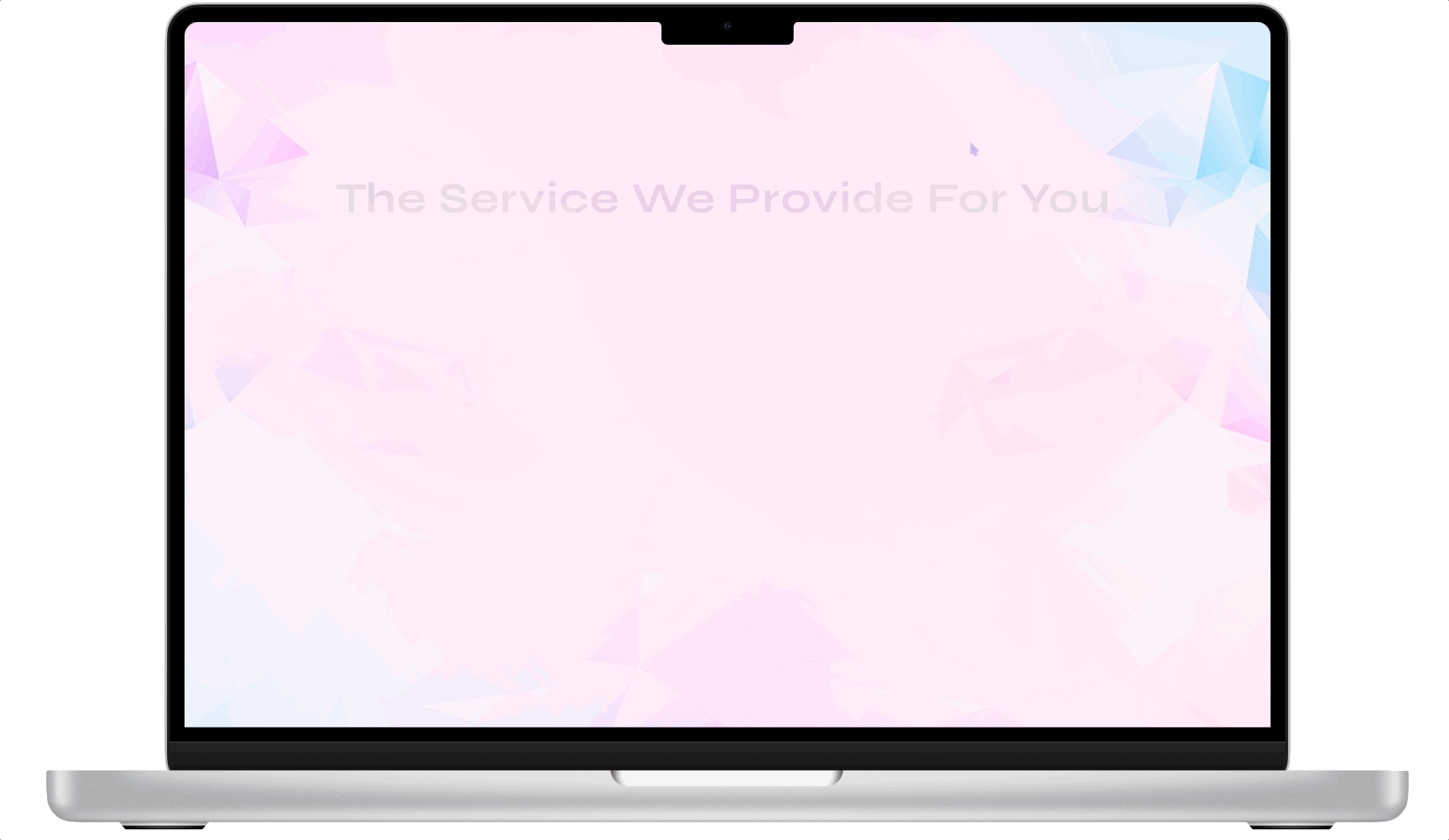
'Our Services' Section
In the 'Our Services' section, I meticulously organized and showcased our comprehensive range of offerings. Each service is thoughtfully listed, and to enhance user interaction, I implemented motion effects that activate when hovering or clicking on the services. These effects not only create an engaging and dynamic user experience but also provide users with additional information and a deeper insight into each service when they interact with them.
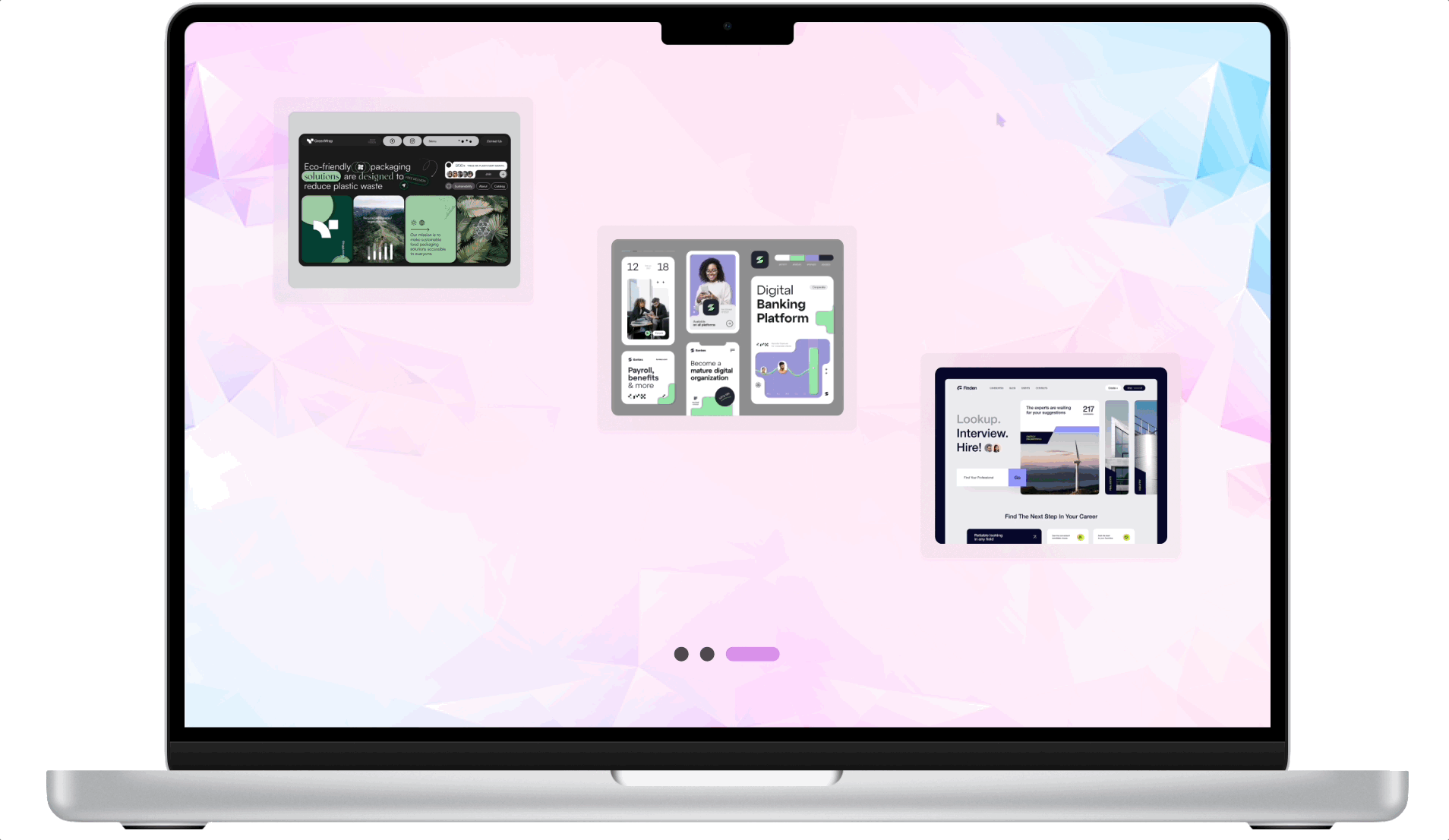
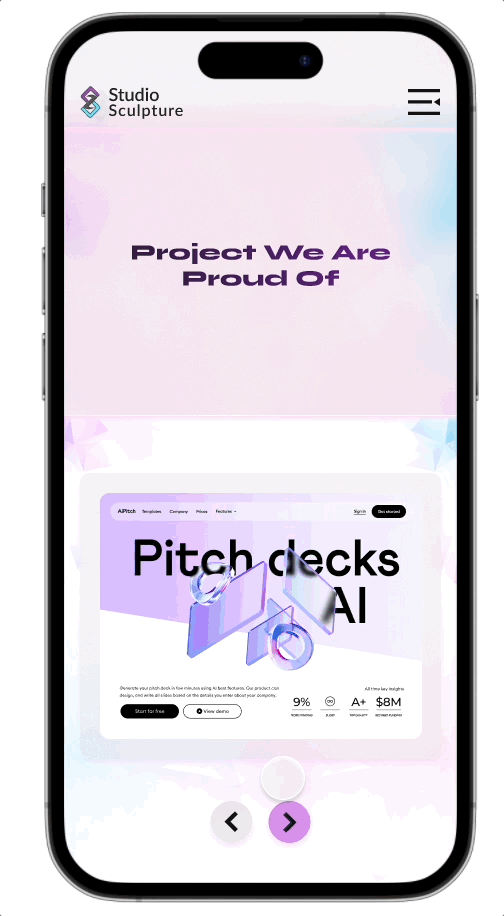
'Case Studies' Section
In the 'Case Studies', I presented a curated collection of our notable works, providing users with detailed insights into the projects we've undertaken. Each case study offers a comprehensive overview, including project objectives, methodologies, and results, allowing potential clients to assess our capabilities and expertise. This section serves as a testament to our commitment to transparency and our track record of delivering successful projects.
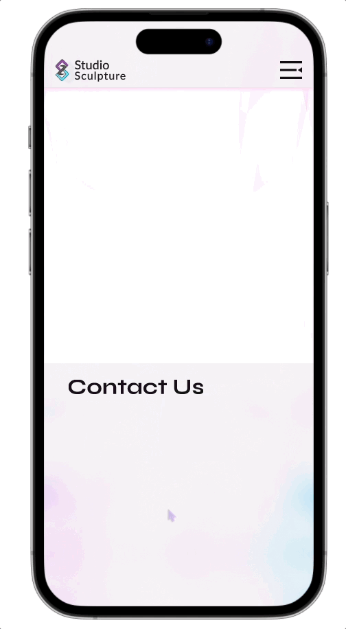
'Contact Us' Section
The 'Contact Us' section is a crucial part of our website, serving as a direct point of interaction between our users and our company. I optimized this section by providing user-friendly forms for efficient data entry, allowing users to edit their descriptions to convey their needs effectively, and simplifying the submission process with a prominent 'Submit' button. This not only makes it easier for users to reach out but also streamlines the communication process, ensuring that user inquiries are well-detailed and efficiently conveyed to our team.
2 Notable Features: Backed by Science and Enhanced User Experience
'Transitional Screens'
An intriguing study shows that transitional screens, strategically implemented, play a pivotal role in creating a seamless and visually pleasing transition between different parts of a digital interface. This not only enhances the overall user experience but also adds an element of cohesion and fluidity to the interaction
'Navigational Bar and Menu'
Scientific research suggests that well-designed navigational menus serve as a powerful tool in expediting user interactions. By providing users with an intuitive roadmap to access various sections of a website or application, navigational menus significantly reduce the time it takes for users to find and engage with the content they seek. This results in a more efficient and user-friendly digital experience, enhancing user satisfaction and engagement.
Style Guide

Conclusion
What I'd do differently next time?
-
Live Support Integration: Enhance user experience with real-time support by embedding live chat, incorporating chatbots for quick responses, and ensuring accessibility throughout the website.
-
Testimonial Section Integration: I'd include a 'Testimonial Section' featuring client feedback, photos, and company names for authenticity. This section would be regularly updated with new feedback and multimedia testimonials to boost credibility and enhance the user experience.
-
Feedback Collection: Gather insights with user-friendly feedback forms, ensuring easy access, and regularly analysing feedback for informed improvements, potentially offering incentives for participation.
-
'Meet the Team' Section: Introduce team members with profiles featuring photos, roles, and brief bios for a personal touch, highlighting qualifications and contributions while considering multimedia elements for added engagement.
Reflection
Creating this case study was a captivating journey, as it provided me with the opportunity to explore a variety of design styles and immerse myself in the realm of motion effects. These elements not only enriched the company's visual identity but also introduced a dynamic and captivating dimension to the project. Additionally, the importance of crafting a responsive design was not lost on me, as I deeply understand the significance of providing users with easy access to the website without the need for app downloads.
Full Prototype in Figma
Feel free to play around with the prototype above and let me know what you think :)